HL RESIDENCE
2024-09-30
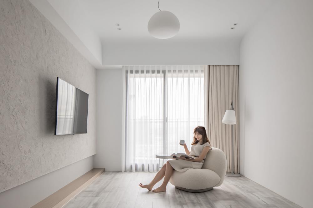
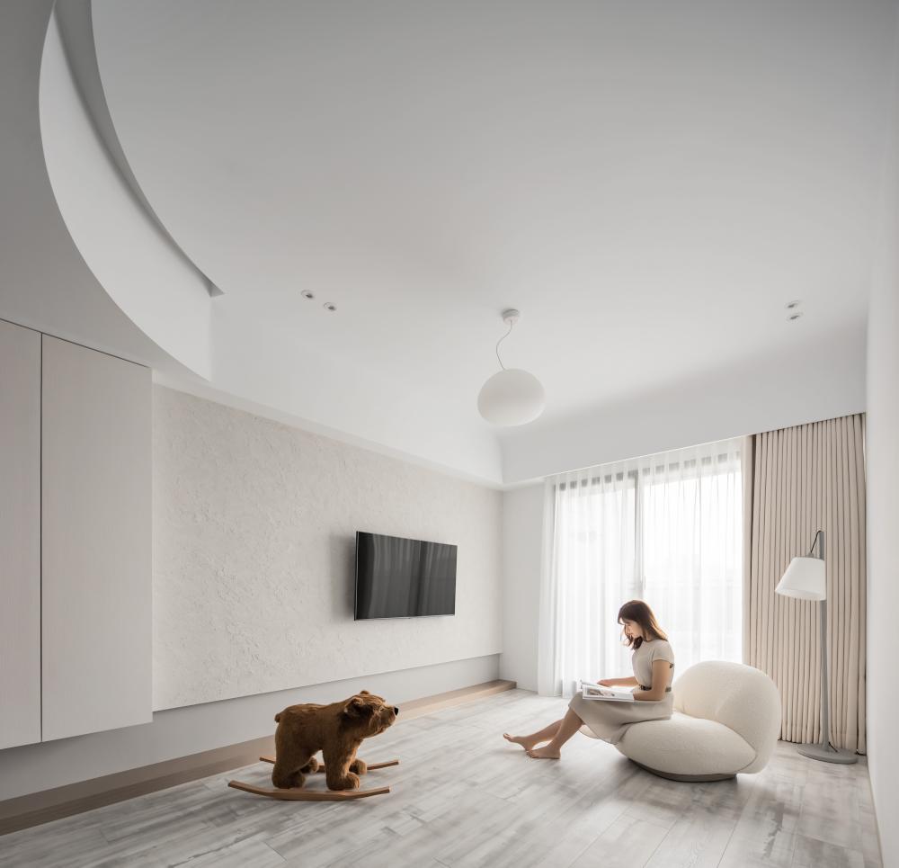
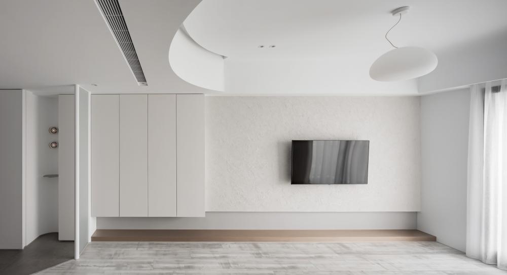
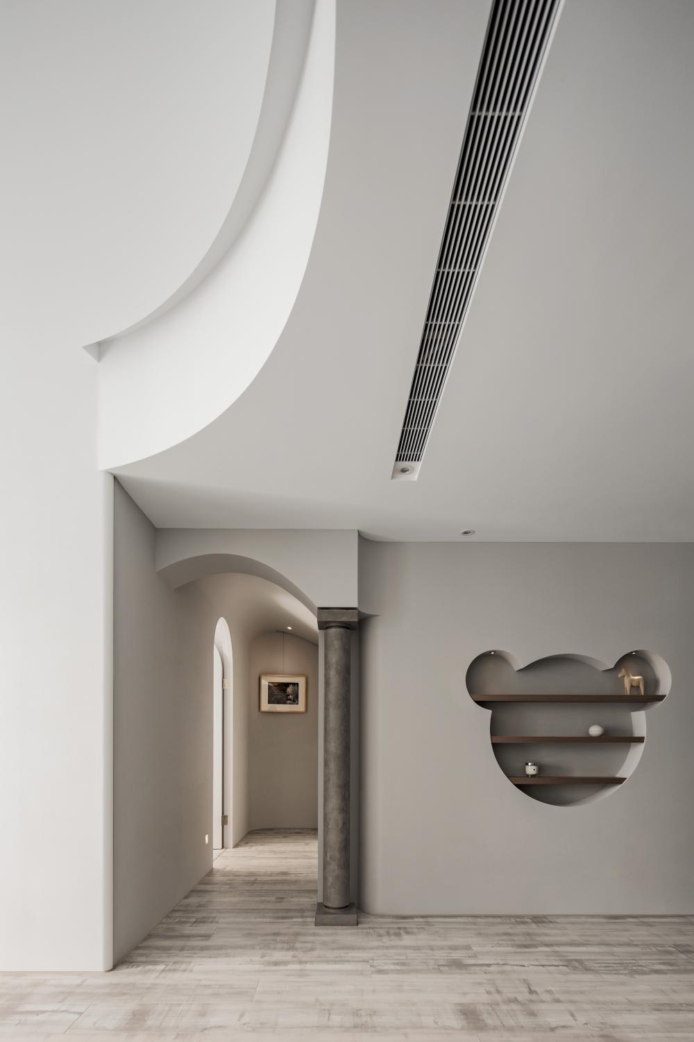
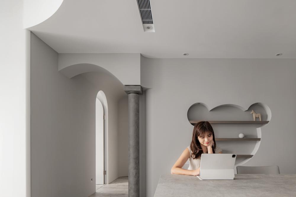
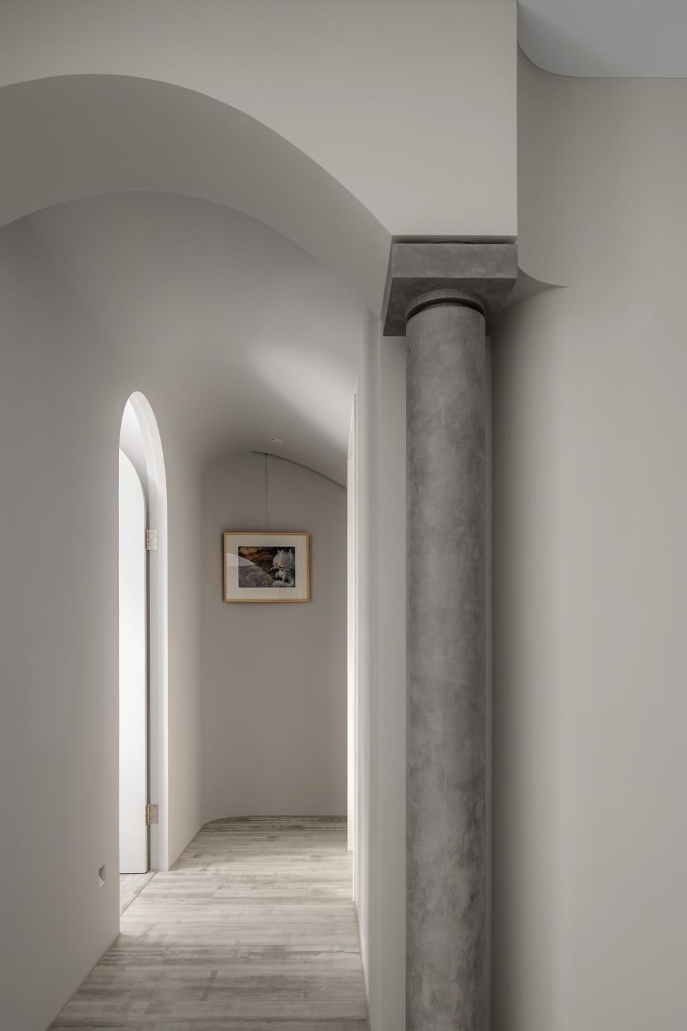
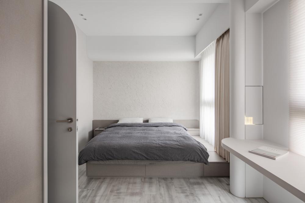
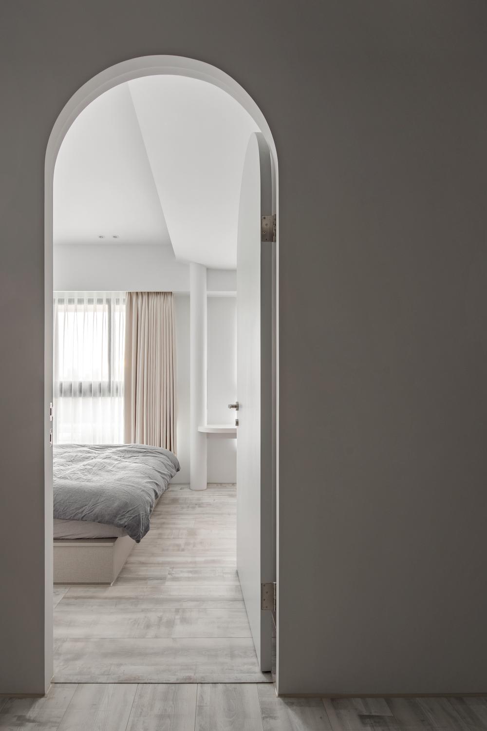
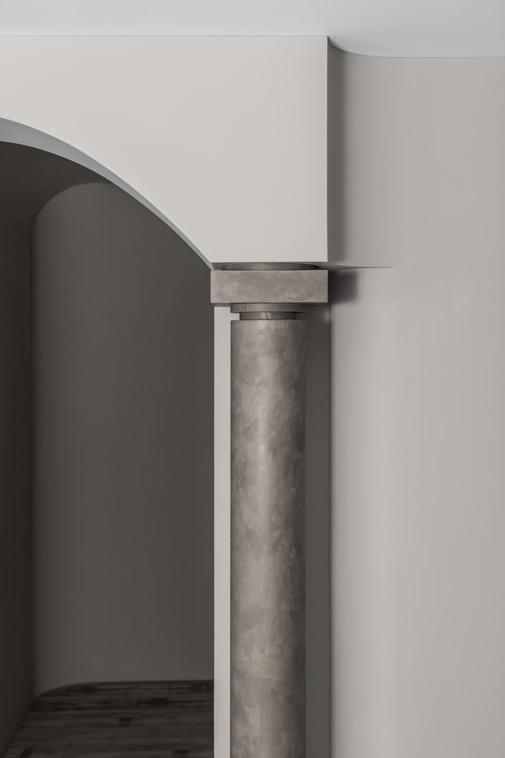
我們運用連續的拱形結構來裝飾原有的樑,以降低樑過低對空間切割的影響。同時,我們將柱體設計為入口的引導、將門扇拉高對比內部打通的臥室,製作出壓縮及放大空間的視覺感受,並選用白色與淡灰色的色調,將主體回歸空間體驗本身。
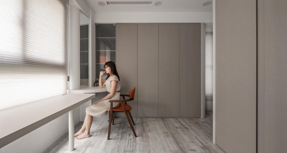
Without making significant changes to the layout, we utilize a continuous series of arches to adorn the existing beams, reducing the divisive impact of low beams on the space. Additionally, we integrate column elements to guide entryways, while opting for a palette of white and soft gray tones to enhance the inherent form of the space.
City Taichung
Size
Designer Lai Yang-chih
Director Lai Yang-chih
Photographer Matterroom
Year 2021
RECOMMEND


 gatsby's castle
 JC RESIDENCE
 PERMEO
 House for いち